
The Covid-19 outbreak has impacted many countries, especially China, Italy and Spain.
Most countries are practicing many ways to prevent the spread from getting even worse. One of the many ways, is social distancing.
The World Health Organisation (WHO) issued a guide that advises people to keep a distance of at least 1m from anyone who’s sneezing and coughing.
In order to encourage social distancing, McDonald’s changed their profile picture of their Facebook page :
You might be wondering, how different can McDonald’s logo be? Well, the two arches of the M logo don’t touch each other anymore; they look like two Ns now!
This might be a simple move by McDonald’s, but it is still a good reminder to everyone out there and a nice touch in a time of crisis.
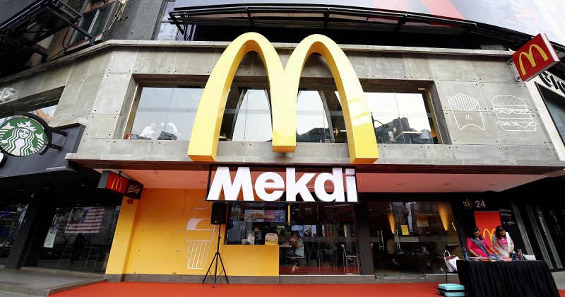
The logo change was only made to the McDonald’s Brazil Facebook page. But, we all know that this isn’t the first time that McDonald’s changed their logo/name. Remember when the McDonald’s in Bukit Bintang was renamed ‘Mekdi’ ?
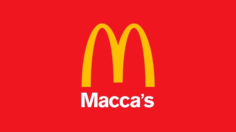
And there was also a time where they changed one of the McDonald’s branches in Australia to ‘Macca’s’.
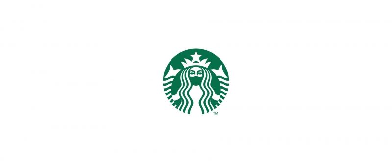
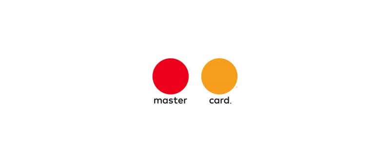
Here are a few mock-ups by a designer from Slovenia who’s redesigned 12 different iconic brands in order to suit the current situation now.
1.Starbucks
2.Mastercard
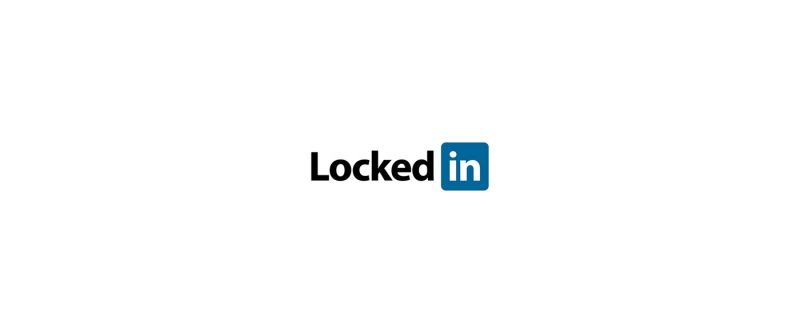
3.LinkedIn
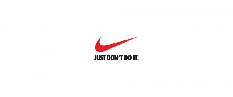
4.Nike
We hope that we humoured you with these mock-ups and we strongly urge everyone to practice social distancing in this time of crisis as the cases of Covid-19 have reached over 1000, and the only way to avoid the numbers from going up is to stay at home and not gather anywhere!
We all just want the best for our country and the world.
Stay hydrated peeps, if you don’t know what to do during the movement restriction, check out our articles as we have a few that would keep you entertained at home!
Which is your favourite revised logo? Let us know in the comment section below!
Header Image : Soya Cincau